Saturday, January 14, 2012

Final design

After consultation on monday, i have to redo again based on my design isn't good.
here goes to my new design:


Name: Cham Yang Hui
ID: 1102701419
Title: Aura of Nature

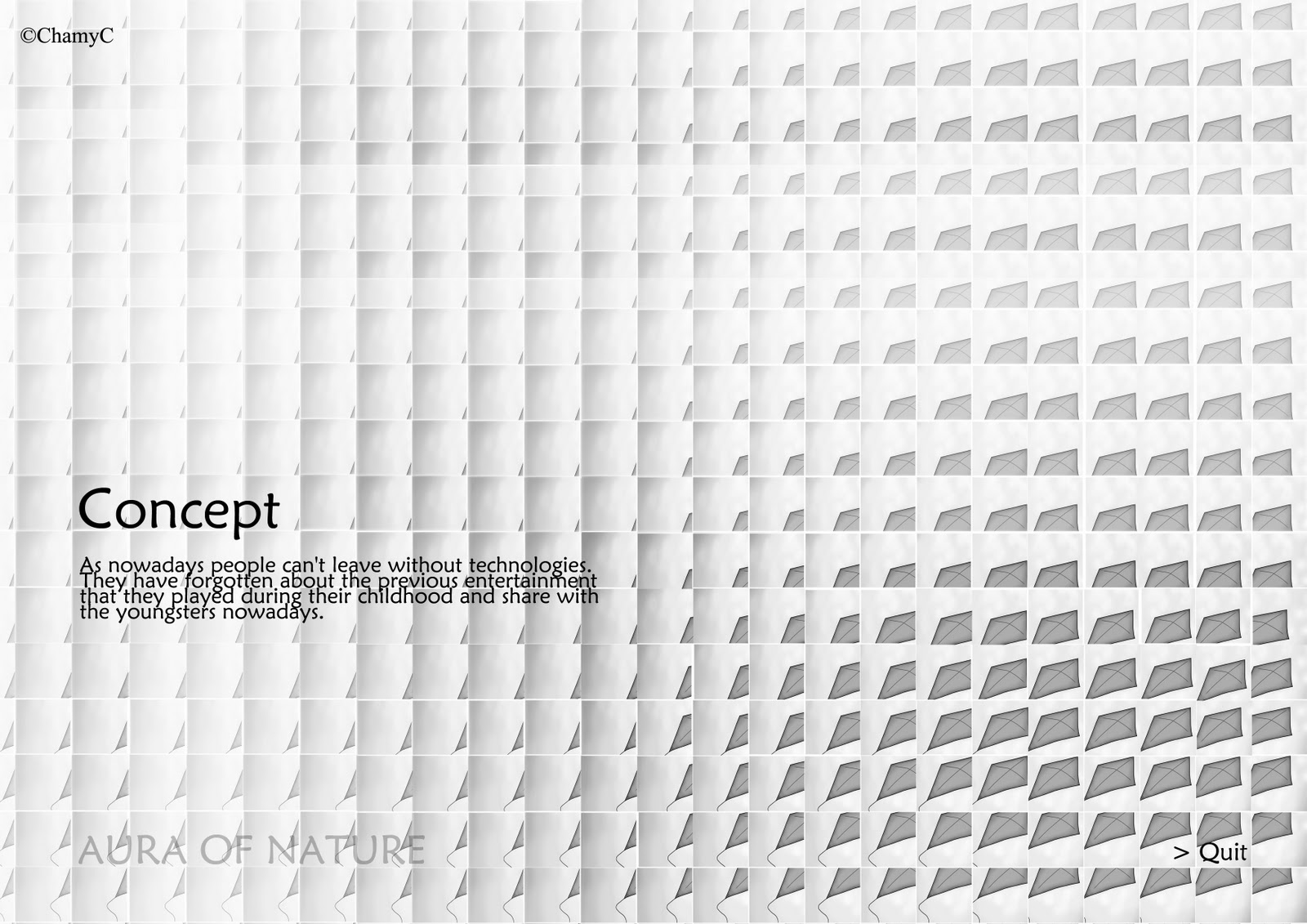
Artist Statement: I choose Aura of Nature as my final project is because I spent more time to create it in assignment 2 and I would like to spread out the message that kite hasn't exist yet. People are just getting forget about it. Actually it is very fun. And I use kite to represent the outdoor games. As nowadays people can't leave without technologies. People feel outdated if they didn't follow up the steps. But as people keep updated, they have forgotten about the previous things they played during their childhood and share with the youngsters nowadays. And kite is the thing which can fly very high control by yourself and you can feel the excitement. You imagine your heart is in the sky, you are the kite flying in the sky, greeting with the birds. And playing kite must have at least 2 person. So you will not feel lonely while playing kite yet bond with each other. Besides that, it must be played in the open air place, normally is play on the field. So it is near with the nature. 

concept board

main menu

content page


gallery page


concept page


Artist Treatment: I used Adobe Photoshop to crop and do the arrangement with the composition of the requirement from the lecture and Adobe Flash to do the interactive part.


Monday, January 9, 2012

Development of Idea

After mr.bad brieved the final project, i prefer to choose the Aura of Nature to be final project interative application since i spent more time on doing the screen design comparing to the 2nd artwork. For this interactive application, 3 submenus are content, concept and gallery.

I have done a sample of the screen design (haven't do in flash for the actionscript) and emailed for consultation. Yet bad comments i got. So i have done another one of design and need to present on tomorrow! It's done with actionscript!

this is the previous one:

concept

content

home page

Will update again after the presentation tomorrow! :)

Here goes to the poster:


Tuesday, December 20, 2011

Final Project Brief

Media Art Design 2: MMA1123
Final Project (40%)

Brief:
This is an individual project.
... Based on Assignment 02. Students are required to choose one of the ideas to be develop
into interactive application. The interactive application MUST have minumum of four pages.
(main menu, 2 subsections and a concept page) Students should apply their knowledge of
what they have learn through out their beta level (Media Art Design classes)

Students are free to select any content(topic) for their interactive application.
Please do not forget that your interactive application should carry expressive and provocative visual.

Objective:
- To demonstrate an understanding of visual communication
- To practice effective visual layout design and create functional graphic user interface
- To apply creative association of technology, technique, tools and applications to produce digital media artwork practically.

Evaluation criteria:
- Overall interactive application concept: 15%
- Creativity, idea development and sketches of ideas: 20%
- Concept Artworks: 5%

Submission Format:
01 One A4 printed concept board mounted on foam board (Your name, id, artwork description printed at the back).
02 A4 Sketches (landscape format): Please compile all your assignments sketches and idea developments (01, 02 + final project)
03 CDROM:
- An Interactive application
- Digital copy of ALL working files for all assignments and project.
- Digital Research documentation for ALL assingments and project.
- Your Name, id, artwork description + blog links (MS word)
04 Blog

Assignment Submission: WEEK 14
Lecturer: Badrolhisham Hashim badrol.hashim@mmu.edu.my

Sunday, December 18, 2011

Assignment 2: Final Artworks


Name: Cham Yang Hui
ID: 1102701419
Title: Aura of Nature

Artist Statement: I choose kite is because i feel that people are getting forget about it. Actually it is very fun. As nowadays people can't leave without technologies. People feel outdated if they didn't follow up the steps. But as people keep updated, they have forgotten about the previous things they played during their childhood and share with the youngsters nowadays. And kite is the thing which can fly very high control by yourself and you can feel the excitement. You imagine your heart is in the sky, you are the kite flying in the sky, greeting with the birds. And playing kite must have a least 2 person. So you will not feel lonely while playing kite. Besides that, it must be played in the open air place, normally is play on the field. So it is near with the nature. 

Artist Treatment: I have choose to do digital image as one of my artwork and I used the digital image from the previous semester's artwork and used Adobe Photoshop to crop and do the arrangement with the composition of the requirement from the lecture and Adobe Illustrator to resize on the template which given by the lecture.


Name: Cham Yang Hui
ID: 1102701419
Title: Save!

Artist Statement: I choose bicycle is because i like to cycle and feel the wind when i'm cycling. But as what i saw in this generation, people seldom cycle. They prefer car with air condition. As we cycle, we actually feel relaxing, calm, looking around where you cycled and it is faster than walking. Cycling you can save petrol, save space because it is just a slim transportation comparing with cars and others, free parking, save money, and the most important, save earth! It has no pollution.

Artist Treatment: I have choose to take photograph as one of the final artwork and I used Adobe Photoshop to edit and add the requirement from the lecture, Adobe Illustrator to resize on the template which given by the lecture.


Development of ideas and sketches

For this assignment, my idea is i would like to send out the message about the different between 20th century and 19's century. After consulted from Mr.Bad, my subject matters of bicycle and kite have been proved. I choose these 2 subject matters is because these 2 subjects are part of my childhood when i was young. During that time, technologies haven't been developed like now yet. So children mostly play at outdoor comparing with now generation's children. Actually i feel sad to those children who is just always playing with those smart phones, Ipad, computers, life cannot leave without internet and many other technologies thingy and just seldom have outdoor games playing around with the neighbourhood and friends. The thing i saw is the generation changed. So i would like to remind the people, kite and bicycle haven't extinct yet. We are just forget them. If we share to the youngsters, i think that they will like the nature more. If they like the technologies more, i think maybe is because they have been indoctrinated from the beginning.

For the design of the kite, my reference is from John Maeda's artwork, the sunflower.


The design of the bicycle, i take the concept of David Em, create artwork with pixels. So before proceed the artwork, i have sketch some of the angel of the bicycle and i took photograph on it. 


Also, there are some references of the screen design and the submenus:


sub-menus


screen design


Sunday, December 4, 2011

Stage 01- Research and Summary

The new media artists i found are John Maeda and David Em.

Summary of John Maeda
John Maeda is an artist and a computer scientist, and he views the computer not as a substitute for brush and paint but as an artistic medium  in its own right. His mission is to foster the growth of what he calls "humanist technologists". John Maeda usually work on his designs and projects on airplanes or in a coffee shop, where he can be alone and think. He would like to design things for children. He works himself, he sort of sit and stew and his time is very limited. He always try to keep changing his style. He doesn't like to be labeled as a certain style. His motto is renew.

Summary of David Em
He is one of the first artist to make art with pixels. Em's art is difficult to categorize. His work spans multiple media, including all-electronic virtual worlds, film making, photography, and printmaking. He has also worked with live performance and theater. Most of his work exists outside of the mainstream art world. He says he "makes pictures with electronic light" and "sculpts with memory instead of space." He also "evolves images so that they grow into and out of each other".

** John Maeda inspired me by he designs things for children and he keep changing his style. Yet David Em inspired me by he is one of the artist to make art with pixels.


References:  http://en.wikipedia.org/wiki/David_Emhttp://en.wikipedia.org/wiki/David_Emhttp://www.davidem.com/http://www.designboom.com/eng/interview/maeda.htmlhttp://www.fastcompany.com/multimedia/slideshows/content/vision-of-john-maeda.htmlhttp://www.esquire.com/features/twenty-one-more-1199


Assignment 2 Brief

Media Art Design 2: MMA1123
Assignment 02 (30%)

Brief:
STAGE 01: This is an individual project. Students are required to conduct research about digital multimedia artist.
Based on research and findings, student need to select TWO media artist that inspired them.
Write a summary for each artist which conclude artist’s philosophy towards his/her style of work,
including their digital artwork concepts, expression and emotions.

STAGE02: Based on their two summaries, students are required to create TWO screen design
that represent their selected artists concepts, approach and directions.
Both screen design should carry expressive and provocative meanings to stimulate user s mind.
Screen design must include: title, content, three submenu buttons and a quit button.

Objective:
- To understand, explore and creating functional graphic user interface with purposed for digital visual communication.
- To investigate the development of technology in creating digital media art installations.

Evaluation criteria:
- Research documentation: 10%
- Creativity, idea development and sketches of ideas: 10%
- Final Artworks: 10%

Submission Format:
01 Two printed final artworks mounted on foam boards (Your name, id, artwork description printed at the back). Template will be provided.
02 A4 Sketches (landscape format): Idea development and sketches
03 CDROM:
- Digital copy of both artworks
- Digital Research documentation
- Your Name, id, artwork description + blog links (MS word)
04 Blog

Assignment Submission: WEEK 09
Lecturer: Badrolhisham Hashim badrol.hashim@mmu.edu.my


Friday, November 18, 2011

Final for Assignment 1


Name: Cham Yang Hui

ID: 1102701419
Title: Time Waits For No One

Artist Statement: I use clock as my subject matter is because time is very punctual. Every second every minute every hour also very equal. No cheating. So if you wasted your time, time gone means gone. Even you turn back to the time you want, you just lie on yourself. So I have think of a phrase to represent the expression and emotion for time is punctual which is Time Waits For No One.  


Artwork treatment: I choose to do digital image as one of my final artwork and I used Adobe Photoshop to draw, Adobe Illustrator to resize on the template which given by lecture for this assignment 1.


Name: Cham Yang Hui

ID: 1102701419
Title: I Never Take Leave

Artist Statement: I use table fan as my another subject matter is because we use fan most of the time. From our parents generation until now we are still using table fan. And as we are at home or in the room, table fan is always on most of the time. It's off only when we go out. So the expression and emotion for the table fan that I want to express is hardworking. And the phrase for it is Never Take Leave. Besides that, I have choose to take photograph for this artwork because i feel that photograph has its soul in there. 


Artwork treatment: I have choose to take photograph as one of the final artwork and I used Adobe Photoshop to edit, Adobe Illustrator to resize on the template which given by lecture for this assignment 1.


Thursday, November 17, 2011

Development Idea and sketches: Another subject matter, Clock

The presentation wasn't good because i just have one artwork instead of two.
But now i have done both of the artwork. (yay!)
Because of my sketches is draw by imagination, references from internet, and also friend's house's clock.
So i couldn't do exactly the same thing like the table fan which just shooting on it to get a good photographs.
So this time i choose to use table to draw it out~!

this is my sketch.

then roughly define the shape of figure,
then simply identify the different region of figure.
(draw it out by using tablet in Adobe Photoshop) 

After that edit the place which should be tiny, straight, or slightly thick.
Actually i have draw again and again. But this time is better comparing to last semester as digital imaging art got use table to draw for the final. I'm getting know how to use it now. And got ask for improvement from senior and friends. Then for the interactive part, i draw an arrow which something have the connection with the font.


Wednesday, November 16, 2011

Development Idea and sketches: Table fan

After the presentation, i edited the interactive button again which just added a little image after the phrase of "I Never Take Leave." I have tried to draw a big one which i think it is annoying and it just spoil the artwork. So after i tried and tried, i just draw a small one right after the phrase.

BEFORE:


 AFTER:


Monday, November 14, 2011

Development of Ideas and Sketches

After choosing the 2 subject matters. The next step is to develop the ideas and do the sketches.

the sketches of the clock.

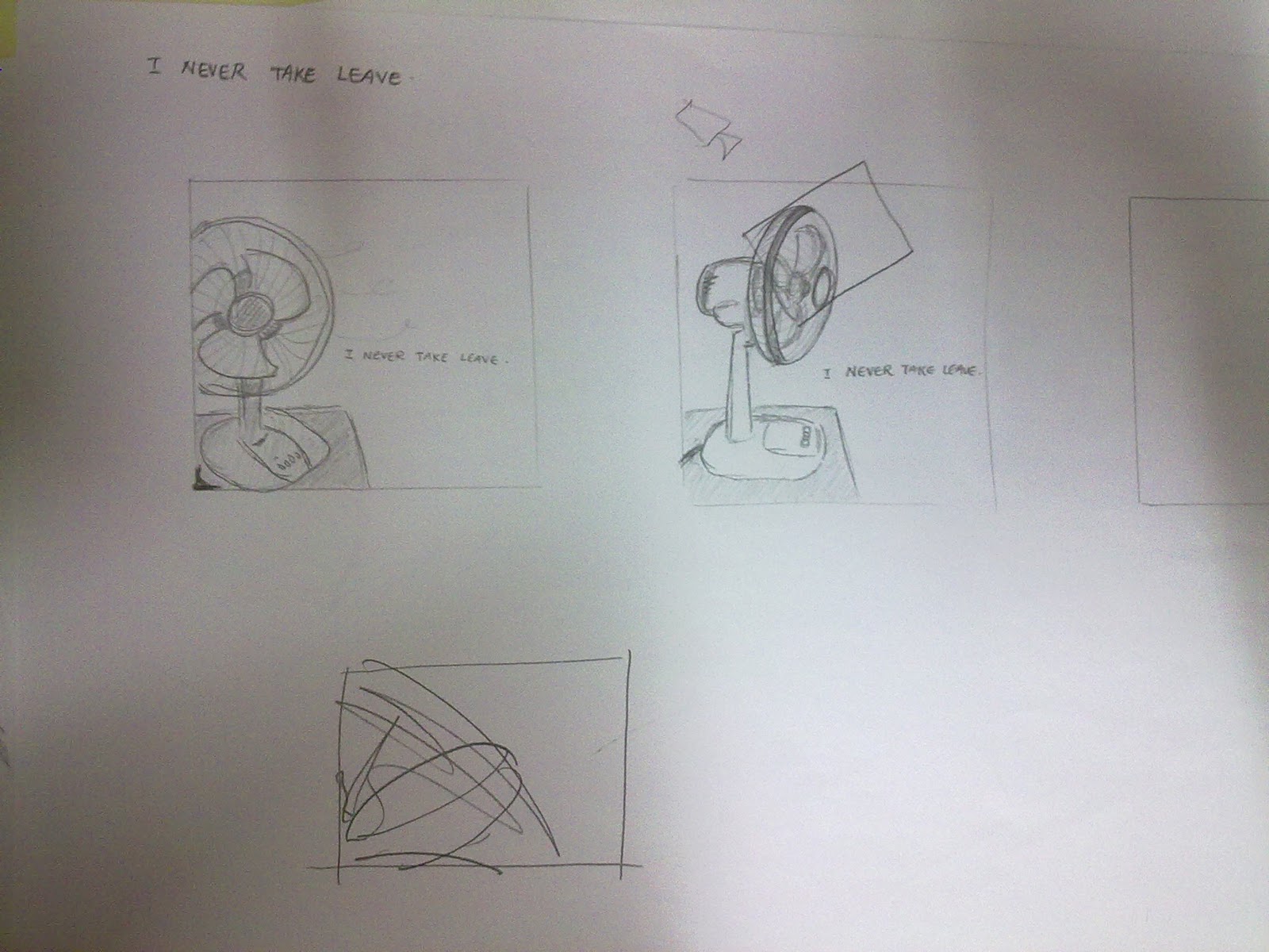
the sketches of the table fan.
After i went to consult from Mr. Bad, he suggested that the table fan doesn't meant have to be the whole fan, even just a small part of it, people already know " that is a fan ". Another one, the clock, he prefer the zoom in one. The sketches i just draw based on my imaginations, references from internet or even friend's house's clock.


Here are the photos that i shoot for the table fan and i have picked some for consultation..
01

02

03

04

After consultation, i choose picture 02. And i still working on the interactive for the screen design. 
Although i just bold the word of never in the phrase of I NEVER TAKE LEAVE. But i don't it's strong enough. I will change it again.


*Yet the clock still in the progress.... >_<*


Friday, November 11, 2011

The Definition of Semiotics and Semantic

Semiotics, is the study of signs and sign processes, indication, designation, likeness, analogy, metaphor, signification and communication. Semiotics is closely related to the field of linguistics, which, for its part, studies the structure and meaning of language more specifically. Semiotics is often divided into three branches:
- Semantics: Relation between signs and the things to which they refer; their denotata, or meaning.
- Syntactics: Relations among signs in formal structures
- Pragmatics: Relation between signs and the effects they have on the people who use them

Syntactics is the branch of semiotics that deals with the formal properties of signs and symbols. More precisely, syntactics deals with the "rules that govern how words are combined to form phrases and sentences." Charles Morris adds that semantics deals with the relation of signs to their designata and the objects which they may or do denote; and, pragmatics deals with the biotic aspects of semiosis, that is, with all the psychological, biological, and sociological phenomena which occur in the functioning of signs.


Semantic, is the study of meaning. It focuses on the relation between signifier, such as words, phrases, signs and symbols, and what they stand for, their denotata.

Linguistic semantics is the study of meaning that is used by humans to express themselves through language. Other forms of semantics include the semantics of programming languages, formal logics, and semiotics.

The word "semantics" itself denotes a range of ideas, from the popular to the highly technical. It is often used in ordinary language to denote a problem of understanding that comes down to word selection or connotation. This problem of understanding has been the subject of many formal inquiries, over a long period of time, most notably in the field of formal semantics. In linguistics, it is the study of interpretation of signs or symbols as used by agents or communities within particular circumstances and contexts. Within this view, sounds, facial expressions, body language, and proxemics have semantic (meaningful) content, and each has several branches of study. In written language, such things as paragraph structure and punctuation have semantic content; in other forms of language, there is other semantic content.

Semantics contrasts with syntax, the study of the combinatorics of units of a language (without reference to their meaning), and pragmatics, the study of the relationships between the symbols of a language, their meaning, and the users of the language.

Exercise from class

We are asked to draw 10 subject matters.
From the subject matters that we draw, we need to express it's emotions and expressions.
Then only choose 2 subject matters to proceed our assignment 1.
Here goes to my subject matters...


I drew puzzle, key, high heels, fan, flats, emotional photo, clock, jeans, hula hop and camera.
After consultation, i decided to choose table fan and clock to be my subject matters for my assignment 1.
The emotion and expression of table fan is hardworking and the clock is punctuality.

Friday, November 4, 2011

Assignment 1 Brief


Media Art Design 2: MMA1123
Assignment 01 (30%)

Brief:
This is an individual project. You are a creative person! Think visually!
Students are required to created two conceptual screen based artworks to provoke / stimulate their target audience emotions.
Both screen design should integrate the appropriate use of visual language and typographic meaning.

Stage01 - branstorming
Stage02 - research & facts finding
Stage03 - initial ideation and conceptualization
Stage04 - project brief
Stage05 - idea developments and process
Stage06 - screen design intergration process
Stage07 - precedence studies
Stage07 - two finalized ideas

Objective:
-          To understand and explain the psychological interpretations using visual arts.
-          To communicate and produce screen based visual communication using word and image effectively.

Evaluation criteria:
-          Research documentation: 5%
-          Creativity, idea development and sketches of ideas: 15%
-          Final Artworks: 10%

Submission Format:
01 Two printed final artworks mounted on foam boards (Your name, id, artwork description printed at the back). Template will be provided.
02 A4 Sketches (landscape format): Idea development and sketches
03 CDROM:
-          Digital copy of both artworks
-          Digital Research documentation
-          Your Name, id, artwork description + blog links (MS word)
04 Blog

Assignment Submission: WEEK 05 (might be change)

Monday, October 24, 2011

NEW SEM STARTS~!

We are going to start our 1st assignment of beta year on trimester 2 SOON.
Stay tune~! :)


Wednesday, September 7, 2011

Video and the Concept Board for the FINAL

Name: Cham Yang Hui
ID: 1102701419
Title: University Life

Artist Statement: To alert people that "Are you enjoying your university life now?", remind people that "enjoy and appreciate the time you have now and have fun before you start working." I create this video is because after i came to university, i feel that if you not sociable and active in some events, maybe your these few years of uni life you might just know few friends only. Living in your own world which not joining or meeting other people is a wrong decision. Maybe you are a quiet person but you still have the time to change yourself or to train your eloquence if you want to. Because i feel that we came to university not just study. We also need to learn something else which not just in the class, entertainment with friends. Mix around, know more friends, social more, it would be helpful in your future. As we said, "A friend in need is a friend indeed."    

Concept Board 01

Concept Board 02


Artwork treatment: Adobe After Effect for the video, Adobe Photoshop for the photos and Adobe Audition for the audio in this final project.


Reference

This video actually is did by my friend for our DJ Club previous event.
So i watch from this video to learn, to get inspiration as i am new in creating video.
My friend who create this video, he already has few years of experiences.
So i just learn from him and learn by myself as well.

- just sharing -


Development of Ideas + Sketches

This is the idea which i plan to do my video.
At first i was think in Chinese, then i translate it into English.

For the photo slide show,
At first, i put the photos which we eat durian in the campus..
Then, the photos which we were having Christmas exchange present last year. It was fun~!!
Next is the sing k session. We love to sing! That time was the biggest crowd ever. Was about 30 something of people went to sing k and we got the biggest room!
After that is the movie session which we always go out with a group of people so the movie ticket is very long. So everyone of us take photo together with the long ticket.
Actually there is a lot of photos but i just picked some interesting and funny photos..

Yet for the survey, i have summarized the answers and i just picked 5 among 11 of them.
  1. Intern life is awesome!! Super duper nice memory only once a university life.
  2. I miss my uni life! Enjoy your remaining uni life, and don't forget to equip yourself with all the necessary skill to get yourself more marketable~
  3. Good result not everything, your mind is important in the future! 
  4. It's going to be hard to find true friends when working after graduate.
  5. I have been working for few years before I came to study in university. Study in uni, I have freedom, entertainment, meet new friends and gain a lot of knowledge. But working, I can earn money for my needed, buy anythings that I want. But I don't have time to spend it or go for vacations.
Sketches for the photo slideshow:

page 01
page 02
 Sketches of the overall video frames:

page 01
page 02
Besides that, also have the progress of choosing font for the concept board:

01
02
03
04
At last i choose the 4th font and arrange the position of the words to the side instead putting it on the center.

For the songs, i have chosen the soundtrack from the Korean drama of Mary Stayed Our All Night which is My Precious and  Running Up.
And of course i have edited both of the songs because of the requirement written that the song must has no vocal.